


Fachzeitschrift
Neue Grafik / New Graphic Design / Graphisme actuel, 1. Ausgabe September 1958
1958
Design
Carlo Vivarelli
Author
Max Bill
(CH, 1908 - 1994)
Publishingund Redaktion
Richard Paul Lohse
und Redaktion
Josef Müller-Brockmann
(CH, 1914 - 1996)
und Redaktion
Hans Neuburg
(CH, 1904 - 1983)
Publisher
Verlag Otto Walter AG, Olten, CH
MediumPapier; Buchdruck
DimensionsBuchgrösse (HxB): 28 x 24.8cm, 75 Seiten
TitlesUntertitelInternationale Zeitschrift für Grafik und verwandte Gebiete
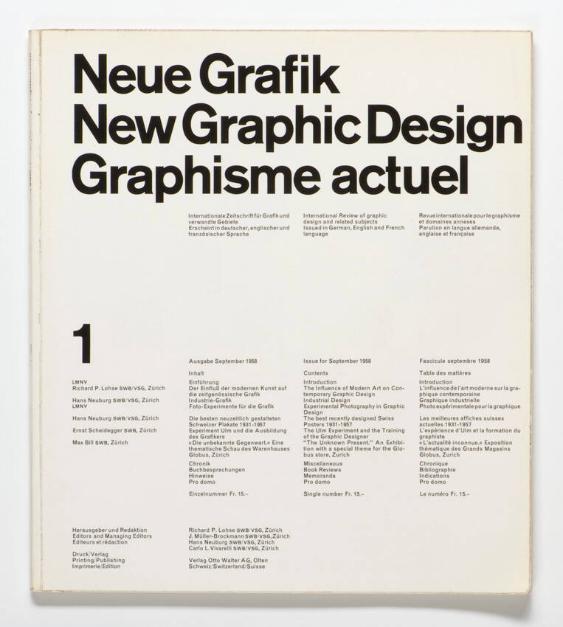
Description«Auch hier dieselben drei Sprachen zum selben Thema. Die Form ist affirmativer, die Syntax essenziell, und im Englischen ersetzt ein anderer neuer Begriff das frühere ‹Commercial Art›. Das Inhaltsverzeichnis können wir schon auf dem Umschlag lesen. Die Schriften sind dieselben wie im Buch von Karl Gerstner, Akzidenz Grotesk auf dem Titel und Monotype 215 für die Texte. Mich beeindrucken daran besonders die sorgfältige Neugestaltung der 20 Buchstaben der drei Titelzeilen mit minimal grösserem Gewicht und die aktive rhythmische Qualität, die durch die extreme Annäherung der Buchstaben entsteht. Vier Spalten und vier horizontale Streifen: ein fixes typografisches System, in dem die Nummer der Zeitschrift als einziges sich änderndes Element besonders ins Auge springt.Richard Paul Lohse, Josef Müller-Brockmann, Hans Neuburg und Carlo Vivarelli – vier hervorragende, zwischen 1902 und 1919 geborene Zürcher Grafiker – betätigten sich zugleich als Herausgeber und als Redaktoren. In der ersten Nummer erläuterten sie die Ziele der Zeitschrift, formulierten aber faktisch auch ein Manifest ihrer Vision, das mir, damals Student auf der Suche nach dem Esperanto, eine Antwort auf die vielen Zweifel gab, die mich umtrieben. Der Hauptartikel, eine Recherche zwischen historischer Avantgarde und zeitgenössischer Grafik, stammte von Lohse.
In der zweiten Nummer folgte ein Artikel von Neuburg über die italienische Industriegrafik und damit meine Entdeckung des Studio Boggeri und mein Besuch in jener von einem Geigenspieler geleiteten Grafikschmiede, die mein Leben verändern sollte.»
Bruno Monguzzi##
“Here too, the same three languages speak of the same subject. The form is more assertive, the syntax essential, and in the English another new term replaces ’Commercial Art.’ Here, already on the cover, we can read the table of contents. The typefaces are the same as the book by Karl Gerstner, Akzidenz Grotesk in the header and 215 Monotype in the texts. I am struck by the careful redesign with a barely augmented weight of the twenty letters of the three titles, and the active rhythmical quality triggered by the extreme proximity between the letters. Four columns and four vertical bands, a rational typographic layout where the number of the issue stands out as the sole element that changes.
Richard Paul Lohse, Josef Müller-Brockmann, Hans Neuburg, and Carlo Vivarelli—four outstanding Zurich-based graphic designers born between 1902 and 1919—are also editors and writers. The first issue, besides explaining the objectives of the magazine, contains a manifesto of their vision and represented, for me, a student in search of Esperanto, a response to many troubling doubts. The main article is by Lohse, an investigation among the historical avant-gardes and contemporary graphic design.
Then, in issue 2, the article by Neuburg on Italian industrial graphic design, the discovery of Studio Boggeri, and the visit to that hotbed directed by a violinist, which was to change the course of my life.“
Bruno Monguzzi
Object numberL LOHS 9-1
DepartmentGrafiksammlung
ExhibitionsCredit LineZürcher Hochschule der Künste / Museum für Gestaltung Zürich / Grafiksammlung
Categories
- Advertising Leaflet /-Catalogue
Siehe auch/Siehe auch
![[Neue Grafik]](/internal/media/dispatcher/202961/thumbnail)